Recall the overall goals of this weather routing system:
Up to this point, this Getting Started guide has been describing how to get to this exact point in the process, evaluating the results so that you can make more informed navigation decisions.
In the spirit of this being a Getting Started guide, many of these evaluation techniques will presented with only a brief description, or none at all. See the user manual for more detail.
Choosing what to analyze.
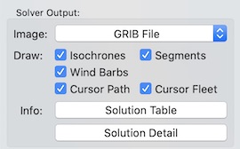
This section describes the Solver Output area in more detail. There is additional detail in the manual page.
 macOS version
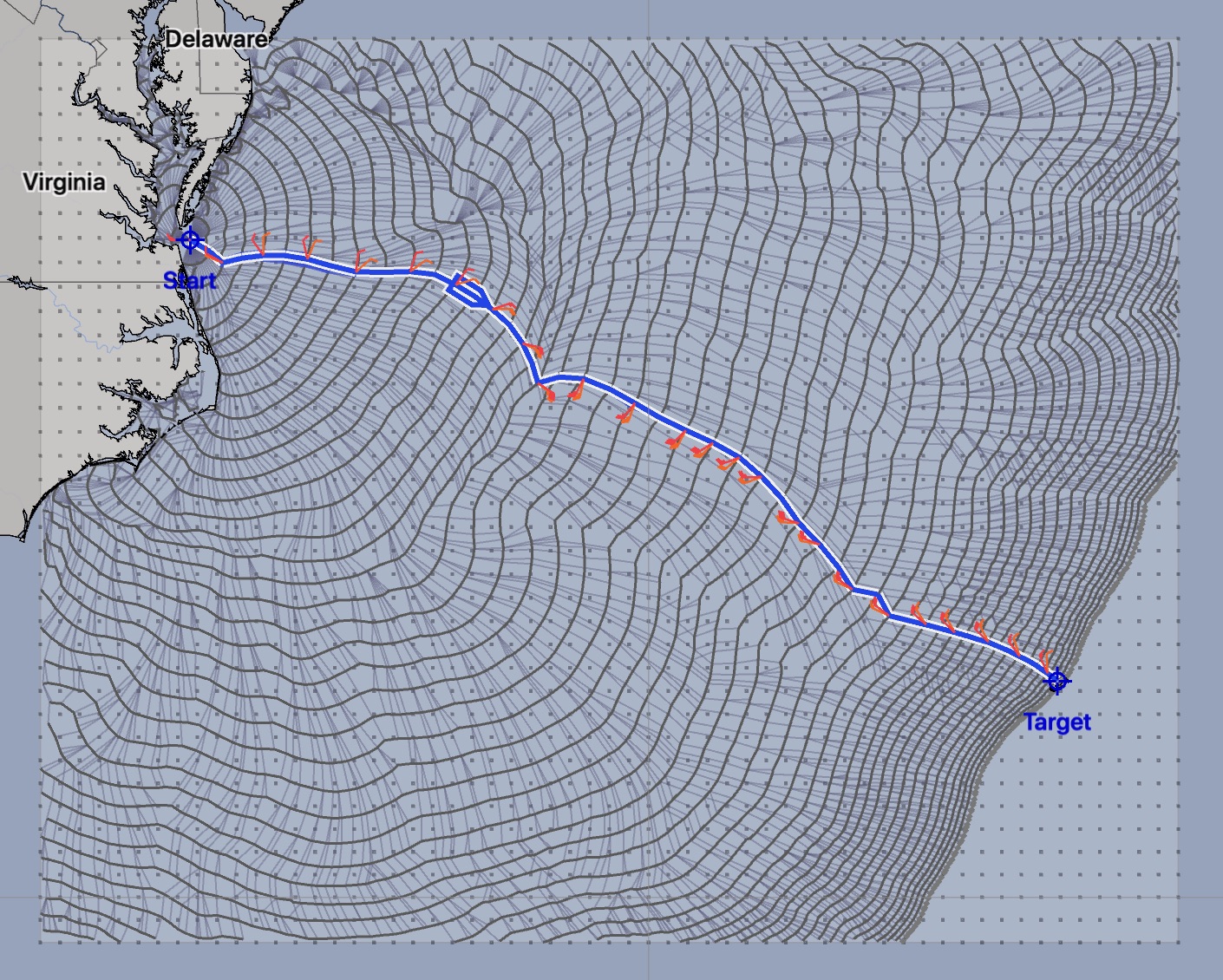
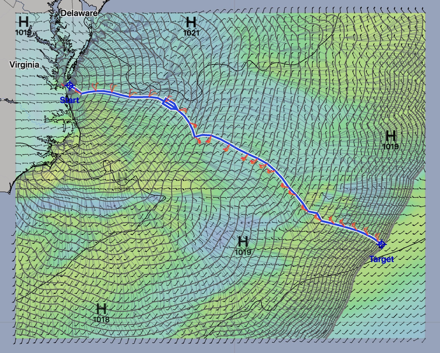
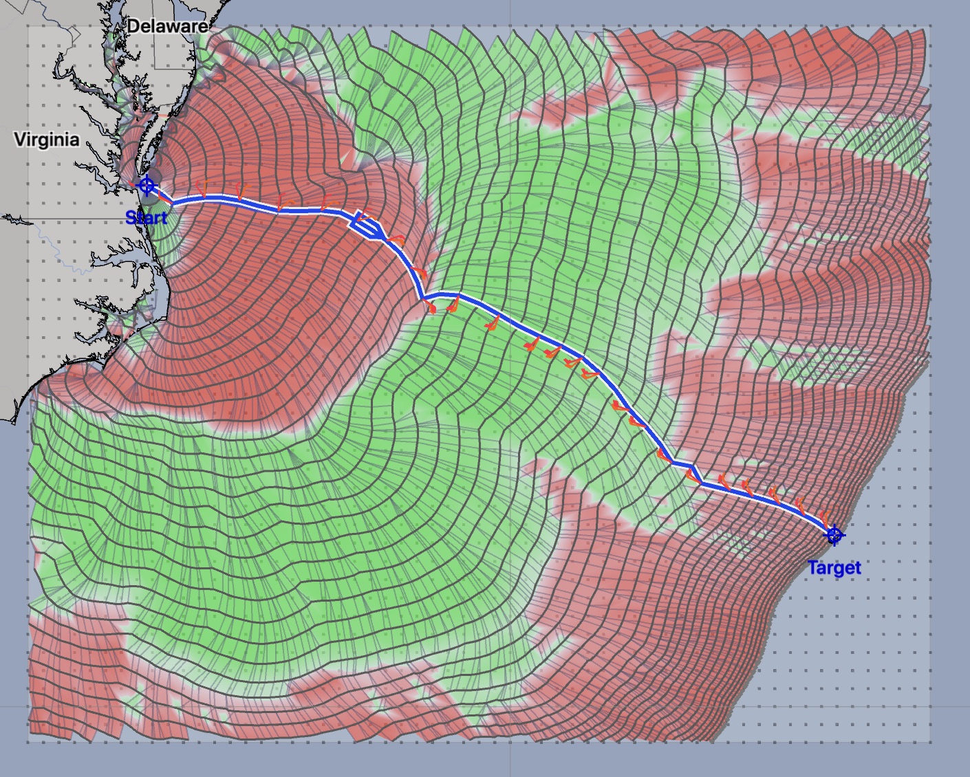
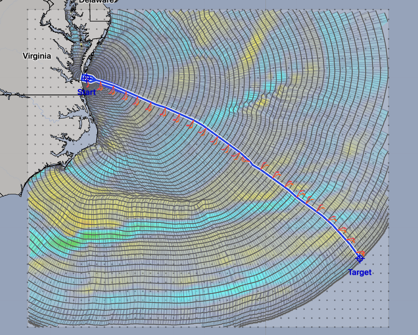
Isochrones.
You can choose what the system will draw by turning on or off the various properties in the Draw section. Examples of viewing only the isochrones or only the segments are provided below. Click on an image to see a larger version.

The isochrone image can show you areas where progress is slowed down or speeds up. The overall flow of the solution can be seen from the segments. By default, isochrones and segments are shown together, which, with practice, can help you understand the solution and areas you need to be wary of.
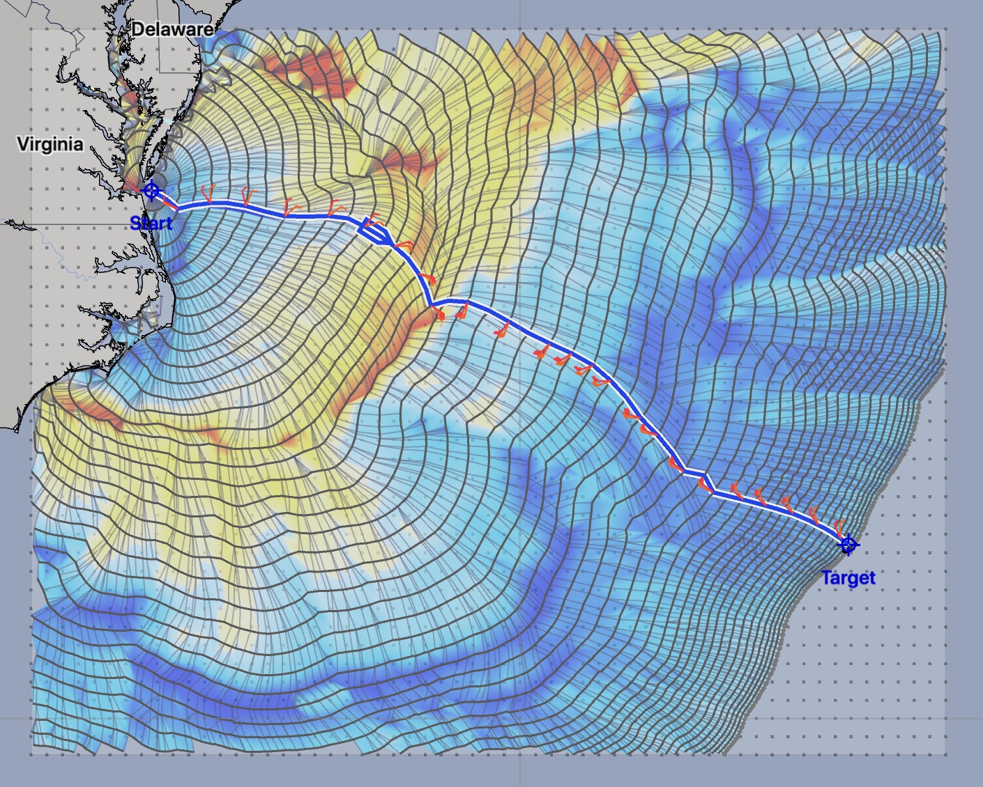
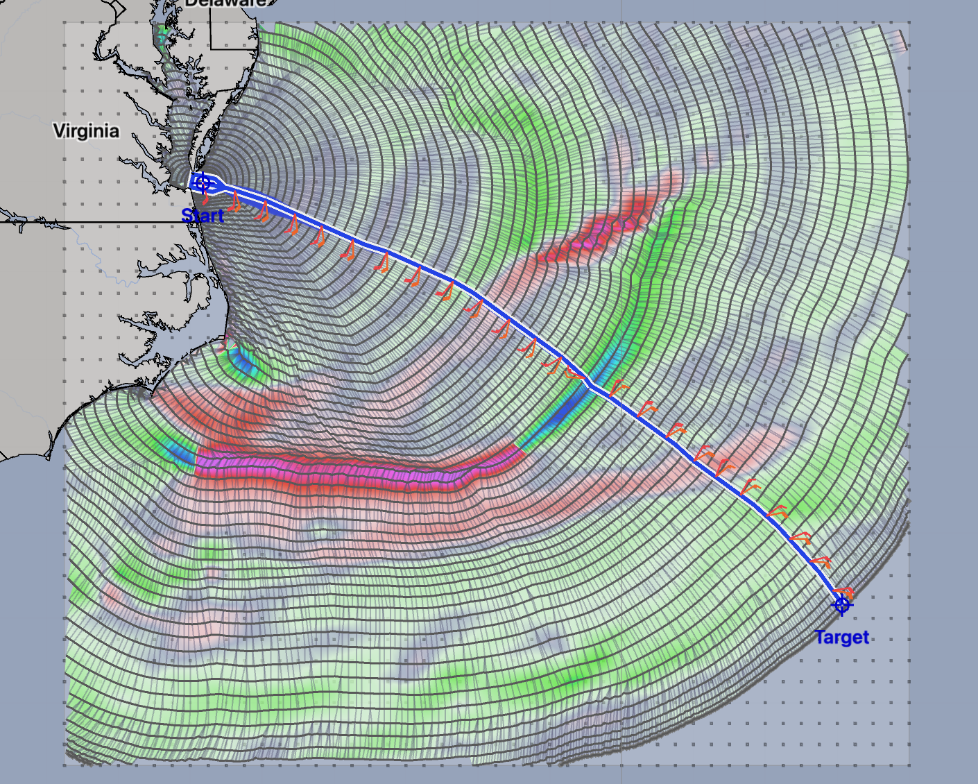
Cursor fleet.
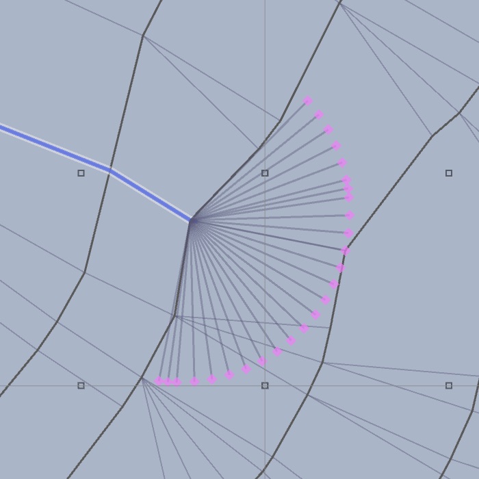
The cursor fleet is unique to LuckGrib. LuckGrib allows you to explore the data the solver used in generating its solution. This can be useful in understanding the results it shows.
If you read the introduction section of this site, you may recall this image:
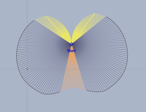
As you move the cursor around the generated solution space, the fleet cursor can be shown. At each point, the yellow lines indicate headings which violate the upwind sailing angle limit you have set. Orange lines indicate violations of the downwind angle limit.
Seeing these yellow and orange lines is a quick way to understand why, for example, the upwind progress for a route may not be what you expect.
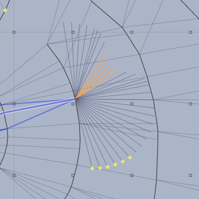
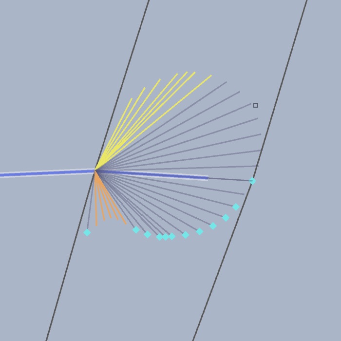
In addition to the yellow and orange lines, there may be dots shown. Yellow dots show a violation of the maximum wind speed you have set, in the comfort configuration section. Cyan dots show violations of the minimum wind speed you have specified. Purple dots indicate that the vessel is motoring.
Looking at the middle image, some of the headings the solver considered at the given point violated the upwind sailing angle limit (they were heading too close to the wind.) Some of the headings violate the downwind limit, sailing too far downwind, and some of the headings resulted in their being less wind that was allowed. (In this case, the minimum wind was set to 5 knots apparent.)
When the isochrone images are surprising you in some regard, viewing the cursor fleet in those areas can often lead to understanding what is going on.
Analysis images.
The Image popup allows you to select from many different types of images. Samples of each of these are shown below. Click on any image to see a larger version.
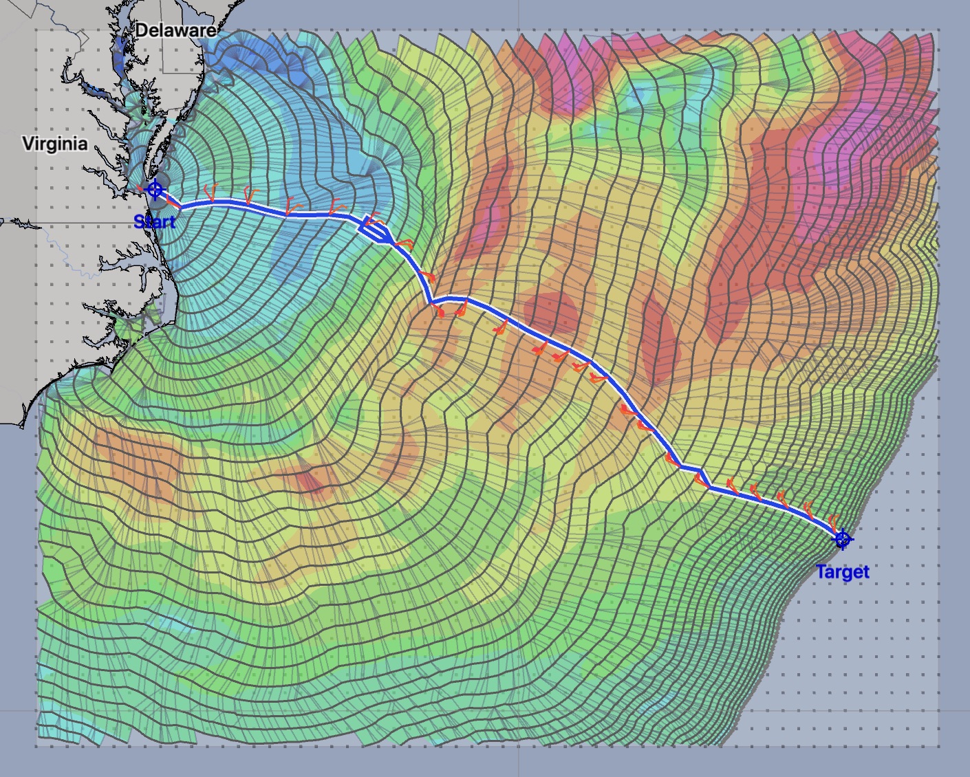
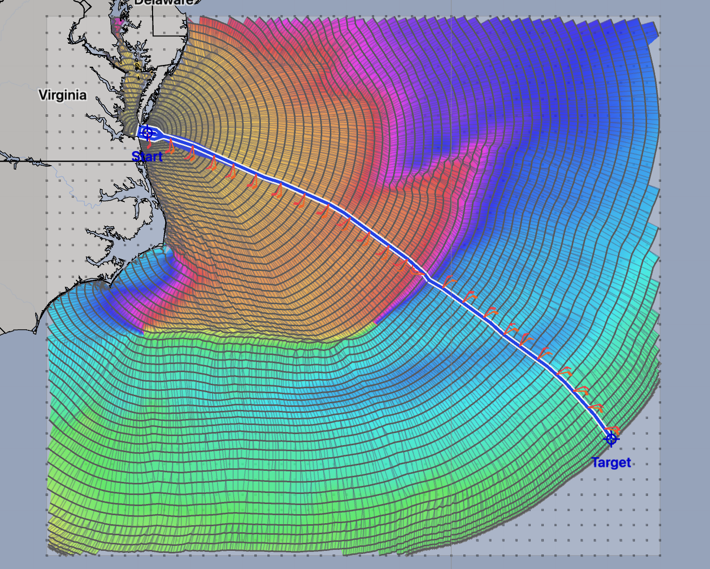
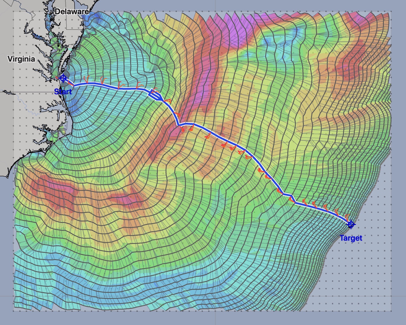

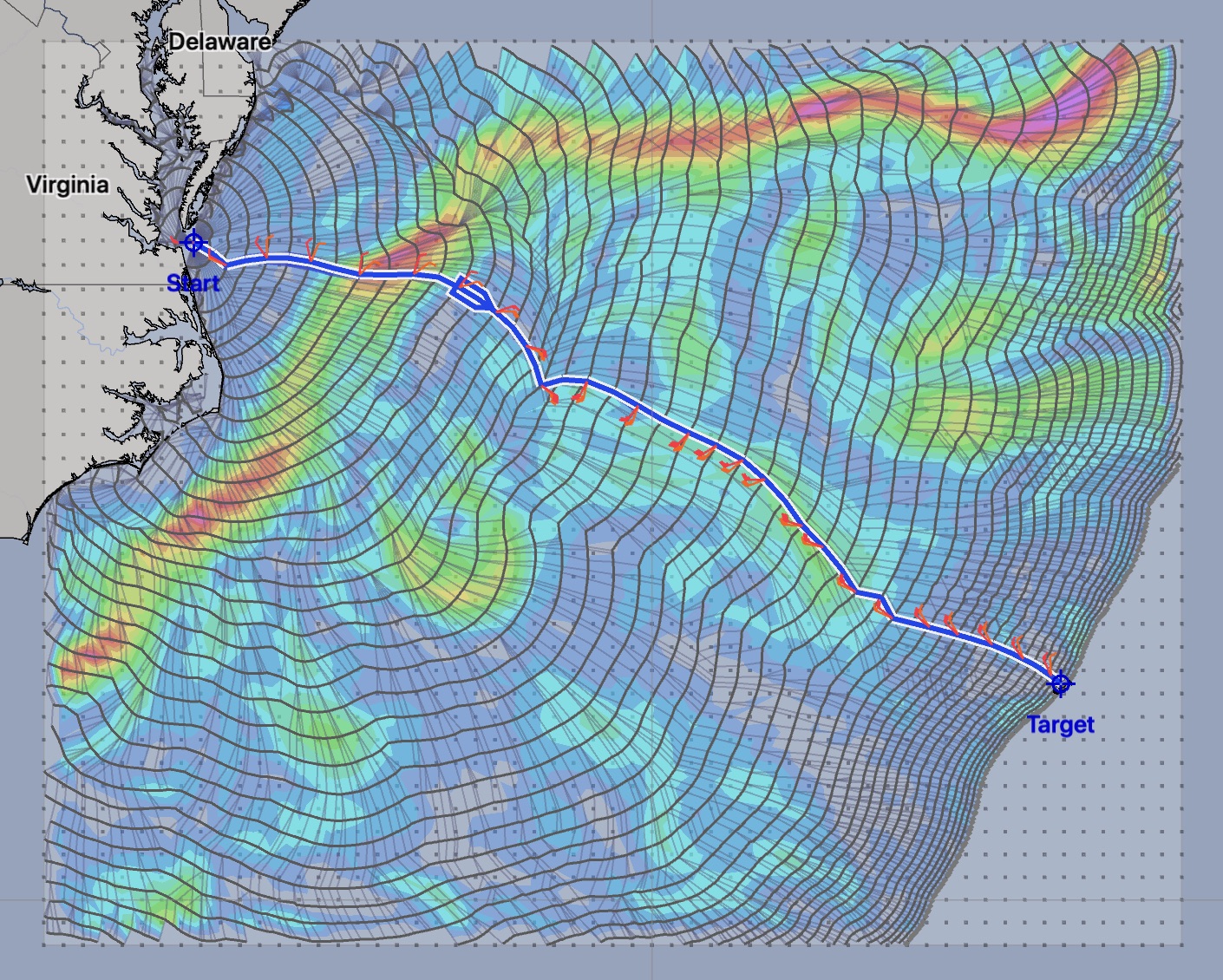
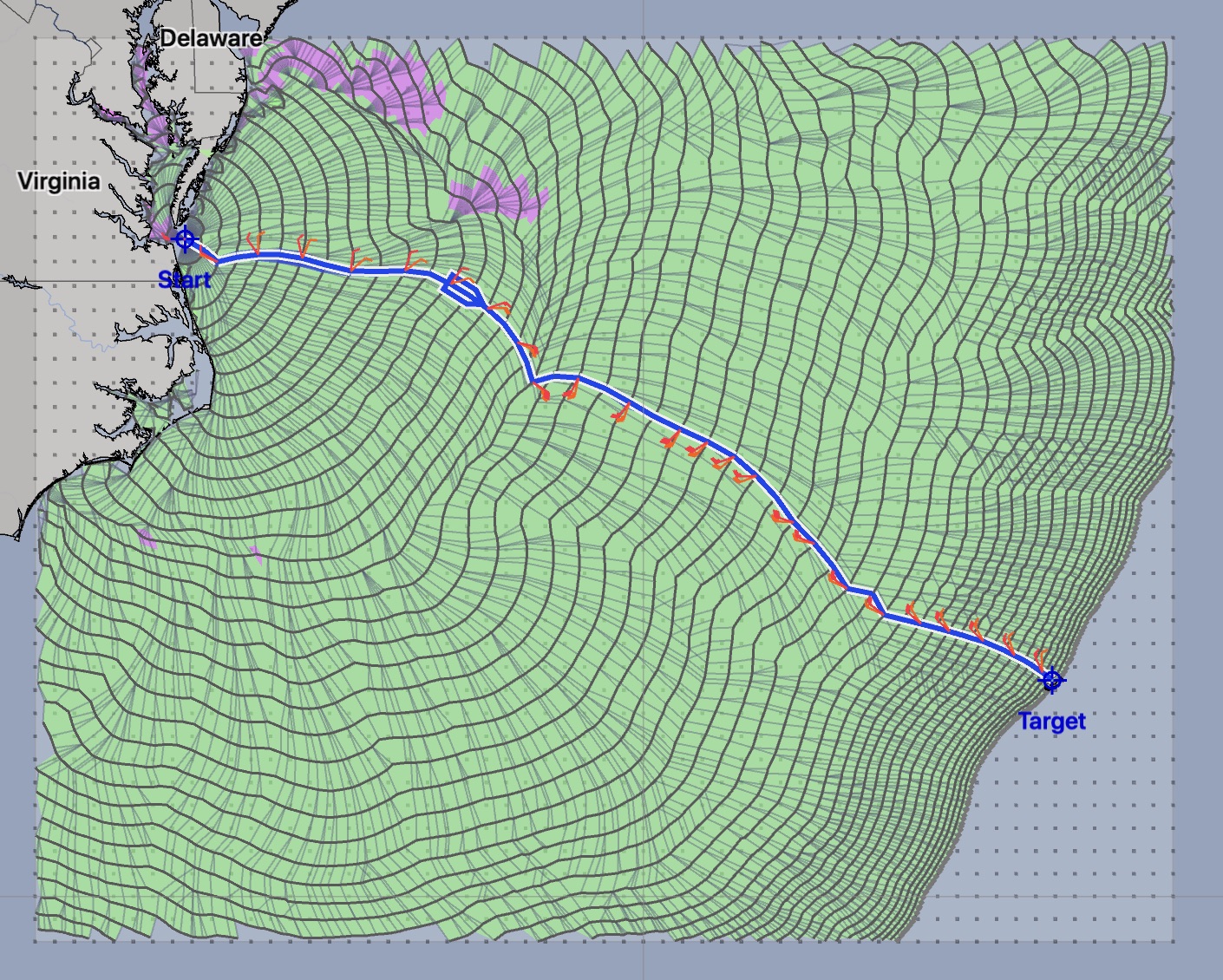
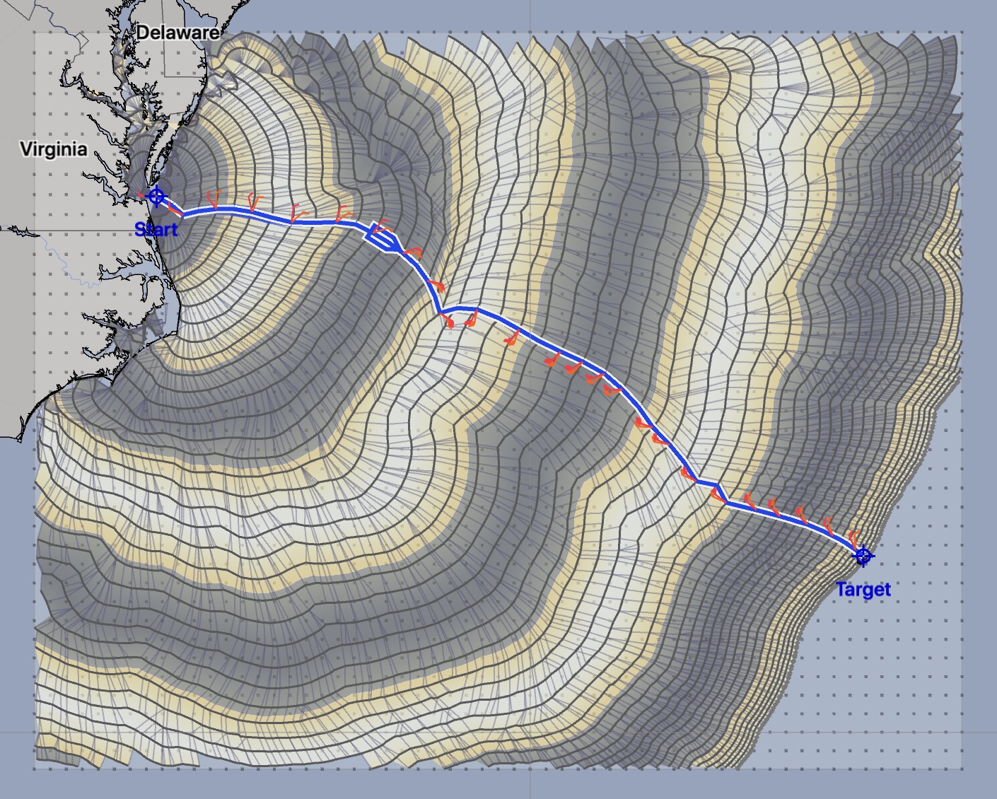
The images show the indicated condition, through time, and across the full set of isochrones (the solution space.) You can think of these images as somewhat analogous to a meteogram, which shows weather conditions, through time, at a point.
There is more detail in the manual page.
Sailing modes
When the solver has created a path, and it is currently selected, a colored bar will be shown in the GRIB timeline that indicates how the vessel is moving along the path. The colors shown are the same as the colors used in the Sailing or Motoring analysis image: green for sailing, yellow for sailing slowly, purple for motoring and red for being hove to.
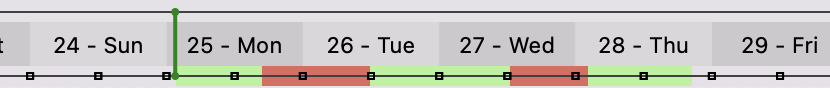 Vessel sailing and hove-to.
 Vessel sailing and motoring.
In addition to showing how the vessel is moving, the colored bar also offers a quick visual indication of the start and finish times for the path. When you are doing departure planning, this is useful as the start time of each departure may not be the indicated start time (the time where the green start time indicator is placed.)
Solution table
If you have read through the Uncertainty section in the introduction, you may recall that this weather router is able to generate many variations for the solutions.
departure planning. The solver can generate variations which leave at different times, allowing you to analyze different departure times.
wind variations. The solver can accept ensemble files with many wind fields, probability winds from NBM Oceanic, or even generate routes using wind speeds from the gust parameter.
for sailboats which are allowed to motor, the solver can solve for both the pure sailing route and the mixed sailing / motoring route, to allow you to see how much motoring helps the situation.
The solution table allows you to manage the complexity when dealing with these many solutions.
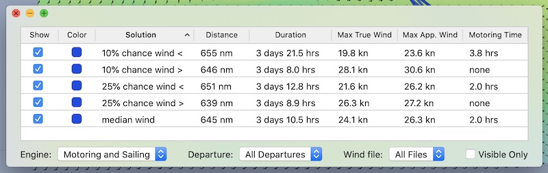
There are several things to note with respect to this table:
selecting any row in the table will select that solution in the system, switching the displayed isochrones, image, etc
each column in the table can be selected, to sort the table on its value. On the Mac, you can also sort based on the columns value, ascending or descending. For example, to sort the solutions by duration, click on the Duration column. (On the Mac, click again to reverse the sort order.)
On the Mac, each column can be reordered and resized. Rearrange the columns into the order you prefer using drag and drop.
if there is a solution you are not considering, turn it off by clicking on its show button.
the menus at the bottom can be used to show or not show the different variations indicated. For example, to only show departues from day three of a departure planning session, use the departure menu to select day three.
if you have many rows which are not being shown (have their show button toggled off) you can remove these from the table by turning on the visible only button in the buttom right of the window. They are not being deleted, only hidden from the table.
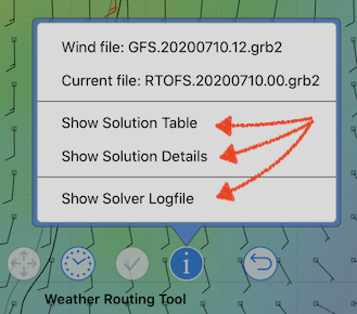
Solution details.
You are able to see a detailed report on the selected solution path by clicking on the Solution Detail button.
Do you want to see a sample report? Click here.
Note that the solution details report has its own set of settings, where you have control over some of the fields which are shown, and how they are presented.
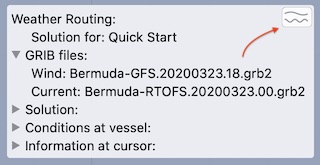
Meteogram
You can view the weather route as a meteogram of values across its length.
On the Mac, this is accessed by clicking on the button in the top right corner of the weather routing text information group:
On iPad and iPhone, you access the WR meteogram by tapping anywhere on the WR information window that is not close to one of the hide / show arrows. This method of viewing a meteogram is similar to how the GRIB meteogram is brought up.
After displaying the WR meteogram, you will see something like the sample shown below:
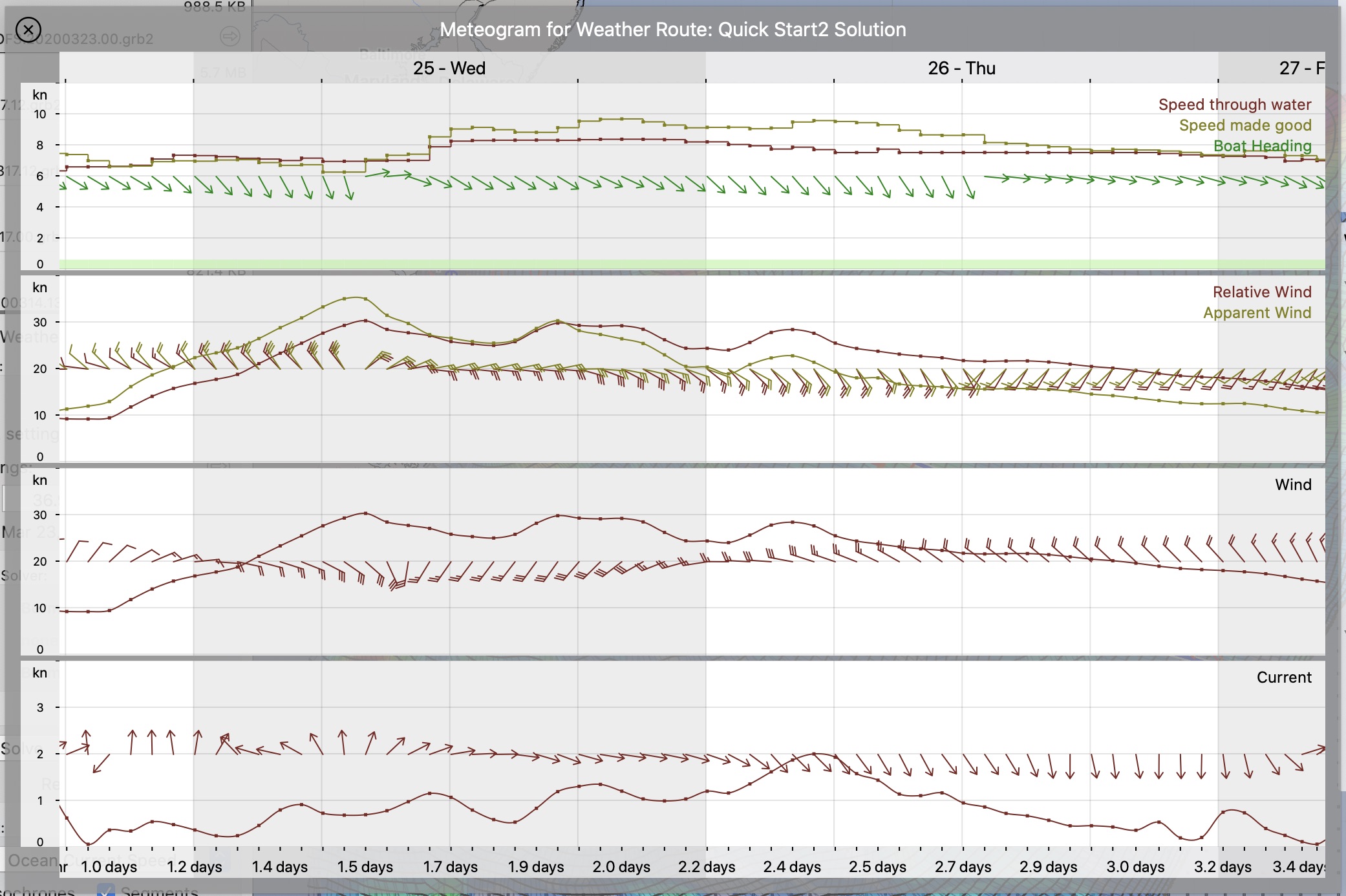 (Click above for larger version.)
Note that the first row, where the vessels speed through water is shown is a little unusual. The speed is shown as a graph with abrupt changes, steps rather than a smooth curve. This correctly reflects what the isochrone algorithm is doing. The boat speed is determined at the start of each isochrone and then held constant until finishing that isochrones time interval. This is followed by the wind being evaluated at the new location and next isochrone time, which in turn, determines the speed for the following interval.